Optometrist website design - 7 sites that rank on page#1 in Google
To have a high-ranking Optometrist website that attracts new clients and patients, you need an optimized and user-friendly design. Is your eyecare website built to meet your potential client’s needs? Well, the Marketing 1776 team can help you improve your existing site or create a new website design for Optometrists altogether!
As a top web development agency, our main goal is to create a visually appealing and functional optometry website design to help you grow your eye healthcare clinic. Consequently, we have hunted the internet to present you with the top 7 Optometrists websites and their respective designs. These designs should give you ideas of how your Optometrist site should work – from the color palettes to the navigation, media, and security.
Let clients find your eye care services by tasking us with the job of creating a website for you, that will make your clinic stand out!
Your Optometology site should be comprehensive enough to convert visitors into actual clients:
- Your website should rank high on the first page of Google for your service-related services. The higher it ranks on search engines, the more visitors you will get.
- The best Optometrist website design should include all the necessary information. Clients looking for an eye doctor want a seamless site with details, including location, contacts, and treatments, just to name a few.’
- The design for Optometrist's websites should be visually pleasant, professional, and a full representation of your brand.
There is no definite look for an Optometrist website design. The preferences change, depending on various factors, like location, target audience and the firm itself. Still, the basic principles of quality web design must be met if you want to rank top in Google. More so, if your goal is to convince visitors to book your services and make appointments.
Here is a simple checklist of factors you should consider when designing a website for optometrists:
- Core web viral tests – Optometry websites must have passed all the core web vitals tests and deliver a top performance score of at least 90 to 100 points across multiple devices.
- Cyber Security – Your visitors need to trust that your Optometry website design has impenetrable security for sensitive information like addresses, health information, social security numbers and more.
- Accessible content – Your optometrist websites should be impressively user-friendly to ensure clients of all age groups and abilities can navigate the pages. You can achieve this through alternative texts, keyboard-friendly navigation, audio descriptions and eye-friendly graphics.
- Visible contact pages – The perfect Optometry website design makes it easy for clients to find you via various modes, including email, calls, or fax.
- Fully dedicated categories or pages of your services – Opticians websites need to have specific pages for all the work-related keyword groups.
- Clear lead capture incentive for your optometrist website design – This is a way to make sure that your site visitors who are just browsing can download some checklist document or pdf. Moreover, this will help you to gather their information and add them to your mailing list.
- Videos and images – Include as many videos and images as possible on your site, so visitors can get a view of the doctor and the facilities.
- Translation – Opticians websites need to have translation plugins, to accommodate as many potential clients as you can.
- Helpful content on the blog – Adding helpful content to your blog helps your rank better in google. Especially if the eye care information is authentic, original, and search engine optimized.
- Connect to social media – Include social media icons on the site so that visitors can easily find you on other platforms.
Note that there is no particularly perfect Optometrist website design. However, you can pay attention to the list of top 7 ranking below, for the keyword “optometrist new york’ and share with us your thoughts!
Eye Associates of New York
- https://www.ea-ny.com/
- New York City.
What they have done well:
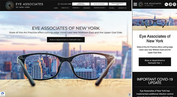
- Displayed detailed contact information. The number is at the top menu.
- Dedicated categories for their services.
- A subtle color palette, which is good for people with eye problems.
- A patient-dedicated page that patients can use to make inquiries.
- Accessibility menu.
- Connected to Google Maps.
Improvements they should consider making:
- Adding a video description.
- The site is relatively slow and needs a faster loading speed.
Manhattan Vision Associates
- https://www.mvanyc.com/
- New York City.
Outstanding web design features:
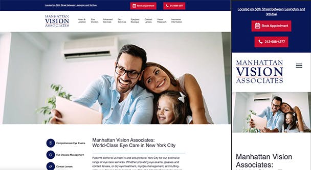
- Clearly defined and visible Appointment and Call buttons.
- Helpful blog under the research category.
- A review widget that displays customer feedback.
- Linked their site to social media.
Improvements that could be made:
- The color scheme needs some changes. There seem to be so many different colors on one page.
Tribeca Eye and Health
- https://www.tribecaeyeandhealth.com/
- New York City
Elements they have built well:
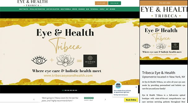
- A youtube video that explains their services.
- A team segment.
- Contact information and booking forms at the top.
- Practical images under the service section.
Improvements that can be made:
- Add translation.
- Boost accessibility.
- One major issue is that you can scroll horizontally too much. This clearly is a mistake made by developers when developing the website.
Eye Q Optometrist
- https://www.eyeqdr.com/
- New York City
Best features on the site:
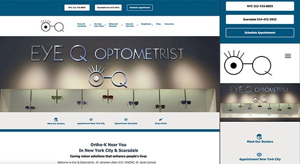
- All the contact information is displayed at the top.
- Patient review page.
- Helpful blog or resource center.
- Eye-friendly color palette.
What they could improve:
- Menu placement – There are 2 different menus, separated by the head slider. This can be confusing to visitors.
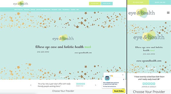
Eye and Health
- https://www.eyeandhealth.com/
- New York City
What they have done well:
- An all-inclusive booking form that includes doctor’s contacts.
- Fine and eye-friendly color shades.
- Definitive images in the service widget.
- The optometric website design has an insightful and active blog.
Things that could be improved.
- Font colors in the menu need to be more visible.
- A video with more information is needed.
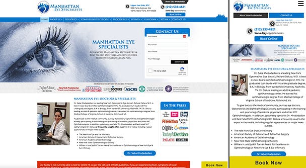
Eye Doctor Ophthalmologist NYC
- Also known as Manhattan Doctor Specialists.
- https://www.eyedoctorophthalmologistnyc.com/
- New York City.
What they have done well:
- Used the correct font with a contrasting background.
- Live Chat support and contact information.
- Subcategories with matching images.
- Separate pages for pediatric eye care.
Improvements that should be made:
- Testimonials
- A video depicting their services.
- The website could load faster on smartphones and mobile devices.
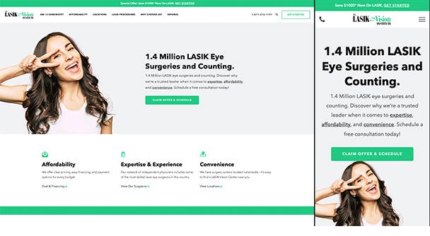
The Lasik Vision Institute
- https://www.lasikvisioninstitute.com/
- New York City.
What they have done well:
- Displaying the number of eye surgeries done.
- The use of two primary color shades boosts visibility.
- Adding FAQ and about sections.
Improvements that can be made:
- Enhancing accessibility.
- Including a description video which is necessary for the best Optometric website design online.
We have come to the end of the Optometric website design review. Analyze the list and consider the best features and parts of the above websites. Then, contact us to implement your needs into your respective site! After all, you can trust us to build a secure, fast, and SEO-friendly Ophthalmology site for your business!