9 Medical Website design examples acorss the USA
Prospective patients are looking for virtual consultations and the right doctor. Therefore, building a user-friendly medical website with helpful content can reach more patients online. As a medical professional, having seamless medical website designs will make you more credible and accessible among your clients.
There are many healthcare practitioners today, but only some have an effective medical digital marketing strategy. In this digital age, hospitals, clinics, and independent doctors should be able to provide various functionality on their websites. The medical website design includes booking services and scheduling essential appointments.
We have the perfect web design for medical practice, whether for massive institutions, clinics, or independent doctors.
Benefits of having winning medical website designs
- Ranking on the first page of google
- Reach different patient demographics
- Patients can access your healthcare services with a touch of a button
- With a proper medical office website design, its easier to do virtual consultations
- You can keep your patients updated with the latest medical news
- The best web design for healthcare institutions helps patients can see your awards and see reviews from others
Common elements to include in the best healthcare website designs
- Contact forms
- High-quality Images and videos
- Success stories with former patients
- Insurance information
- Emergency contacts
- Live chat for consultation
- High-performing core web tests
- SEO optimization on the front end and backend
- Clickable CTA buttons and internal links
- About us page with the team
- Maps and service area widgets
- Engaging headlines and content
9 medical web design examples for converting leads to visitors
Here are the best medical website design templates online. Take a look and get some more inspiration for your health care services.
1. Mount Sinai Org
- https://www.mountsinai.org/
- New York
Excellent features on the website:
- Comprehensive main menu with hover functions.
- Search bar to find further information on the website.
- Automatic slider in the header.
- Onlien consultation button.
- Link to the hospital’s social media platforms (Facebook, Twitter, and YouTube).
- Counter section that shows the number of employees, community locations, and institutes.
- Neat and clean design of the contact page.
- Helpful content under the Patient Care page.
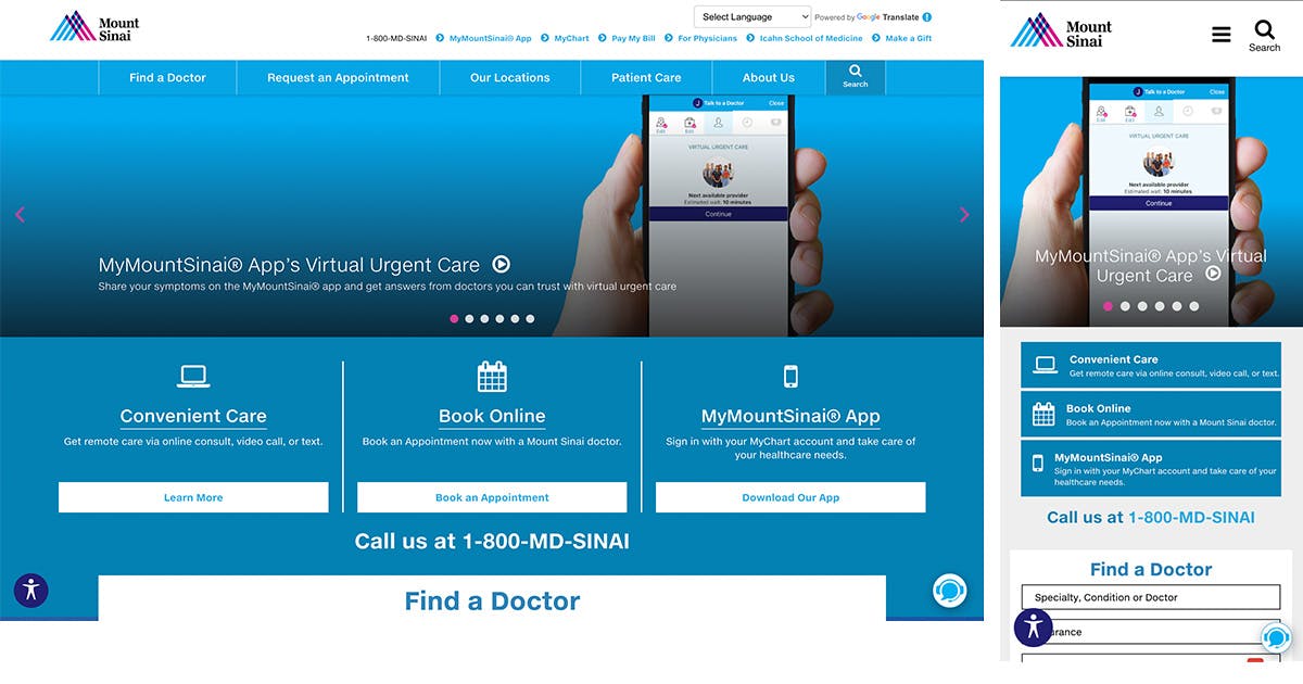
Improvements they can make.
- Adding words from some team members to build patient confidence.
- An FAQ section for quick assistance.
- Emergency contact button.
- Better web design for the press release section.
2. PIH Health
- https://www.pihhealth.org/
- Las Angeles
Excellent features on the website:
- A subtle color palette of different shades of blue.
- Clear typography.
- Specialty widget with clickable links to individual health centers.
- Donation CTA that is engaging to readers.
- Slider with careers and latest news from PIH.
- CTA buttons at the header, which visitors can use to book the ER.
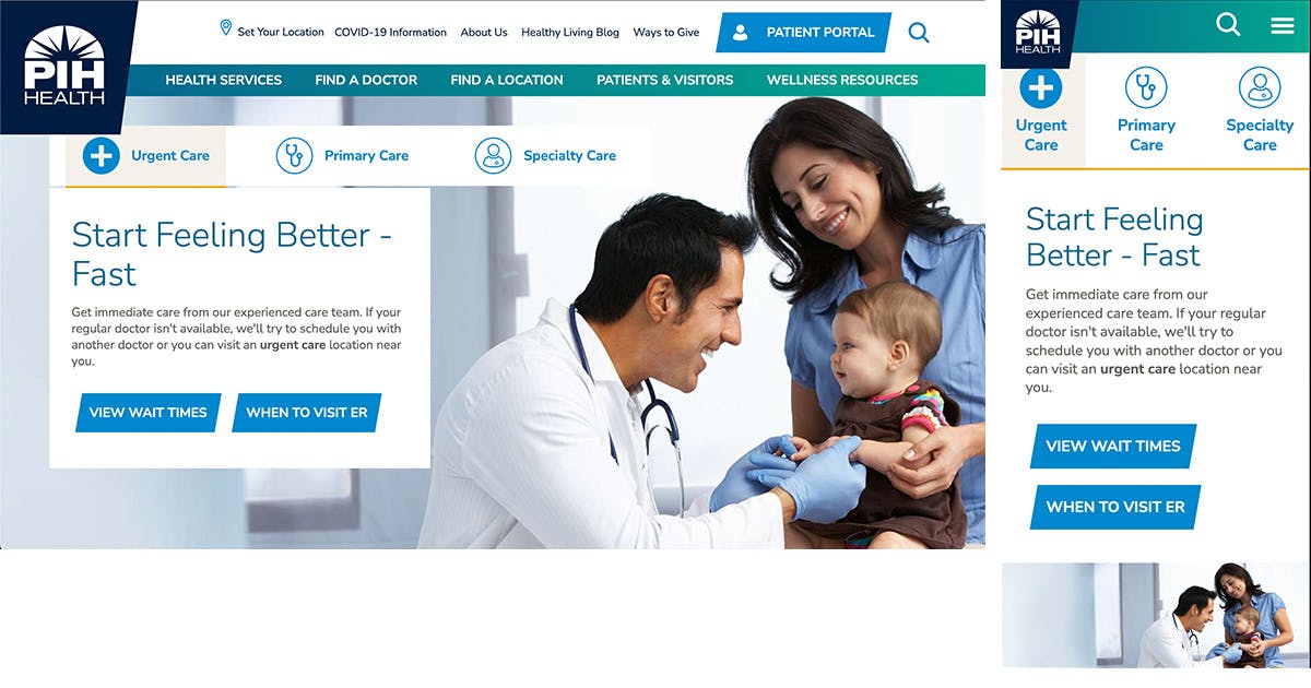
Improvements they can make.
- Use of more original images.
- More content under the centers' section.
- Adding more testimonials and success stories.
3. Mercy Health
- https://www.mercyhealth.com/
- Philadelphia
Excellent features on the website:
- Elegant purple and grey color palette.
- Buttons for the patient portal at the top of the homepage (above the menu).
- Search bar
- Animated slider for a header.
- Appointment schedule button at the header.
- Service buttons with icons.
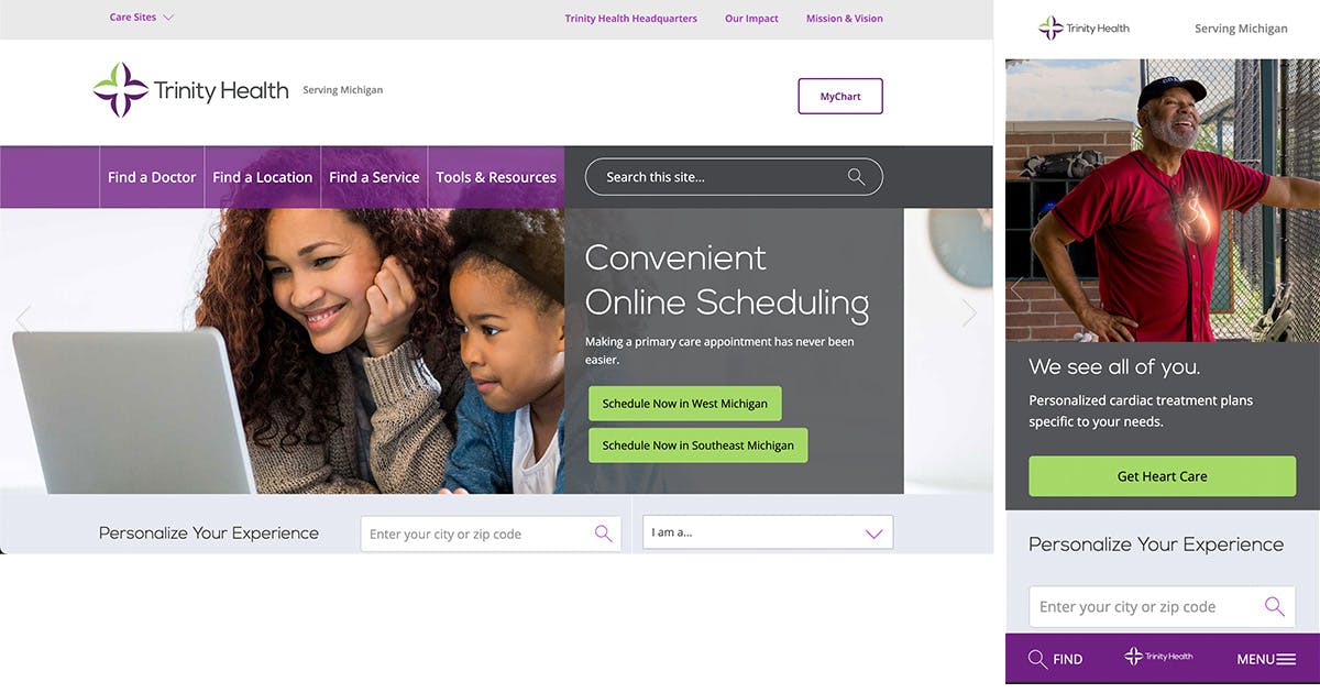
Improvements they can make:
- Add more headlines to divide the different widgets or sections on the homepage.
4. Mayo Clinic
- https://www.mayoclinic.org/
- Arizona
Excellent features on the website:
- Simple and minimalist website design.
- Log-in functionality for patient profiles.
- Available in various translations.
- Search bar at the top.
- Clean and neat fonts and color scheme.
- Helpful blog content with guides, research, etc.
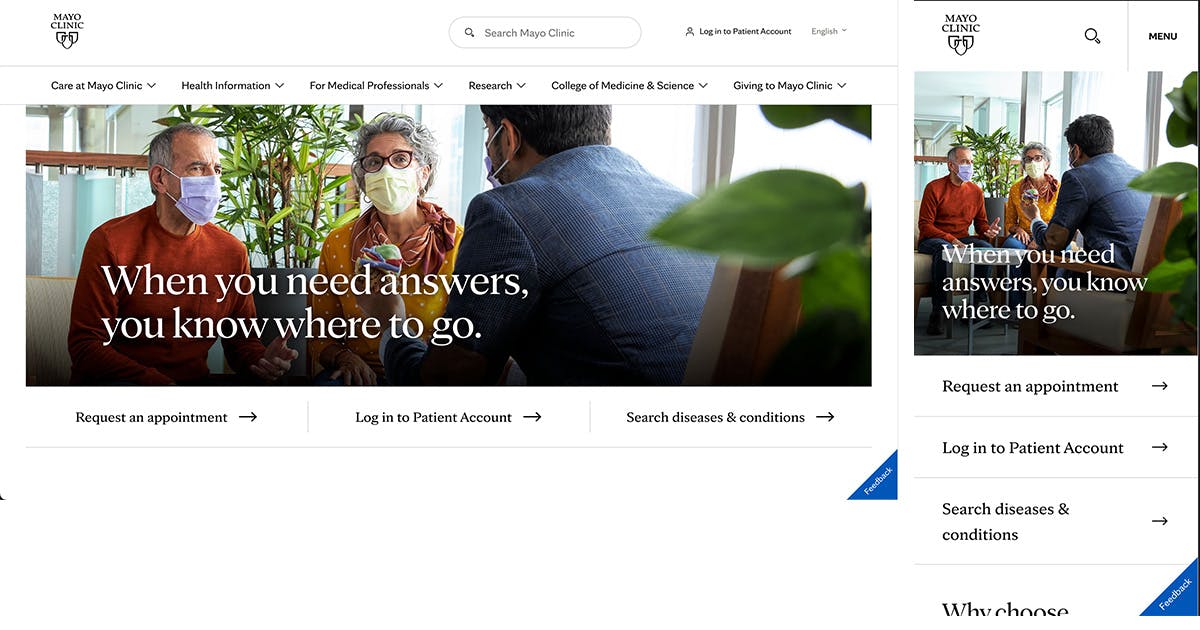
Improvements they can make:
- This is one of the best healthcare website design examples to use. The site is well-known across the world. However, adding more trust factors would be better, e.g., sources of research (in images), certifications, etc.
5. Northwestern Medicine
- https://www.nm.org/
- Chicago
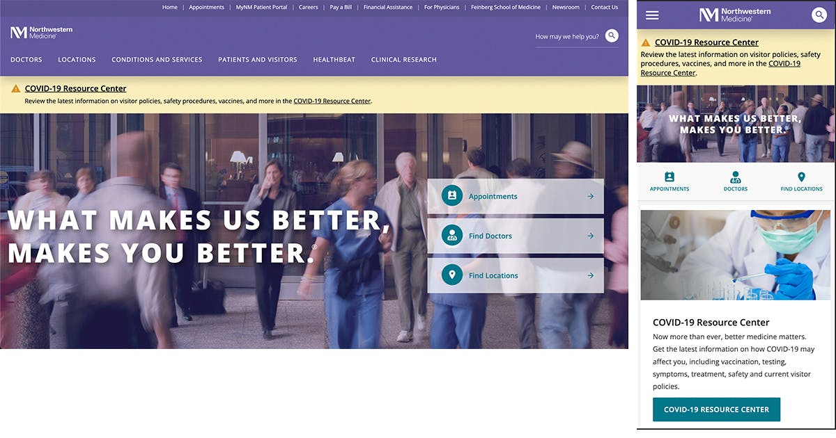
Excellent features on the website:
- Service buttons come soon on the header of the home page.
- Patients can schedule appointments and find doctors and locations with one click.
- Counter showing number of practicing physicians, ranking in Illinois, employees, etc.
- Second counter with more information regarding awards, studies, trials, and specialties.
Improvements they can make.
- The footer font is a bit small for people with sight issues.
- Website should have accessibility functions for people with special needs.
6. University Health
- https://www.universityhealth.com/
- San Antonio
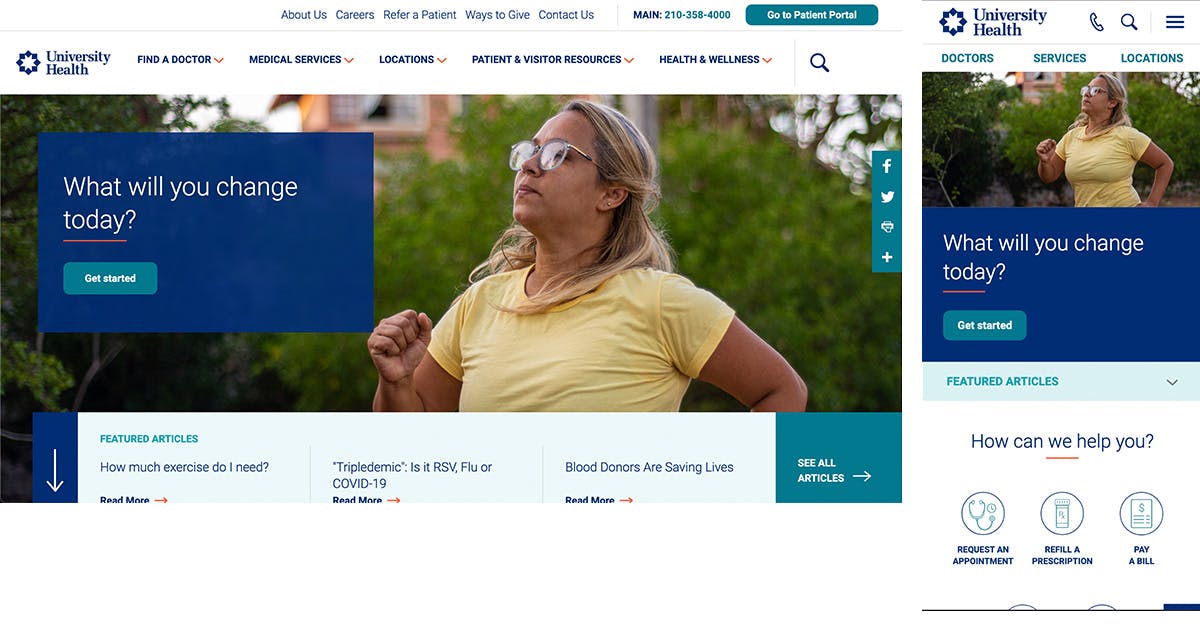
Excellent features on the website:
- Engaging headlines and CTA buttons.
- Fast-loading search bar.
- A well-planned main menu that displays further information on hover.
- Emergency service icons with buttons.
- More information about medical bills with the estimate system.
- Link into My Chart profile for quicker and remote consultations.
- Section for patients to submit their medical stories to share with other readers on the website.
Improvements they can make.
- There is a lot of text. Therefore, they should add more images and white space for a more modern web design.
7. Rady Children’s Hospital
- https://www.rchsd.org/
- San Diego
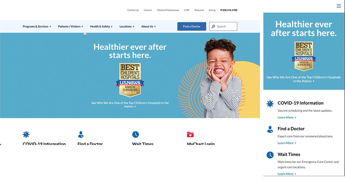
Excellent features on the website:
- The latest award is displayed at the header, making patients want to know more about the website.
- Clickable icons and Learn More buttons for shortcuts to essential services.
- Featured news and highlights widget.
- Videos with helpful information.
- More featured services at the bottom.
- A separate bar where all the hospital’s recognitions and achievements are listed.
Improvements they can make:
- The font at the footer could be made more prominent.
- The hover color on the links at the footer should be more visible.
8. Acclaim
- https://www.teamacclaim.org/
- Dallas Texas
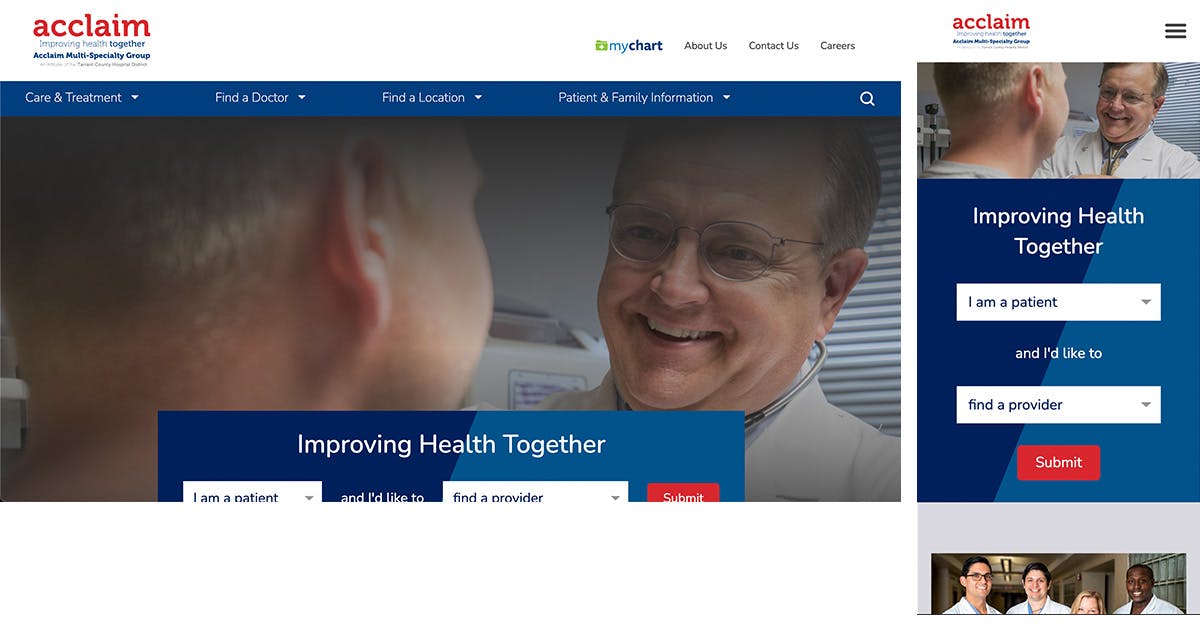
Excellent features on the website:
- Shortcut to all essential contact pages above the main menu.
- Elegant website design for healthcare practitioners.
- Comprehensive main menu with drop-down content.
- Search bar.
- Quick links to finding a doctor or health care provider.
Improvements they can make.
- It seems like the developers focused so much on adding CTAs for scheduling appointments and underrepresented trust factors. A website design for medical practice needs more helpful information on the landing page, including studies, guides, and blogs.
- This medical website design needs more imagery.
9. Montage Health
- https://www.montagehealth.org/
- California
Excellent features on the website:
- An appealing blue and green color palette that keeps the website bright.
- Clickable top menu with links to standard services.
- The website’s design is consistent with Montage’s brand and logo.
- Great choice of pictures throughout the site.
- Information has been well-divided into sections. E.g., articles from the beat, locations, and providers.
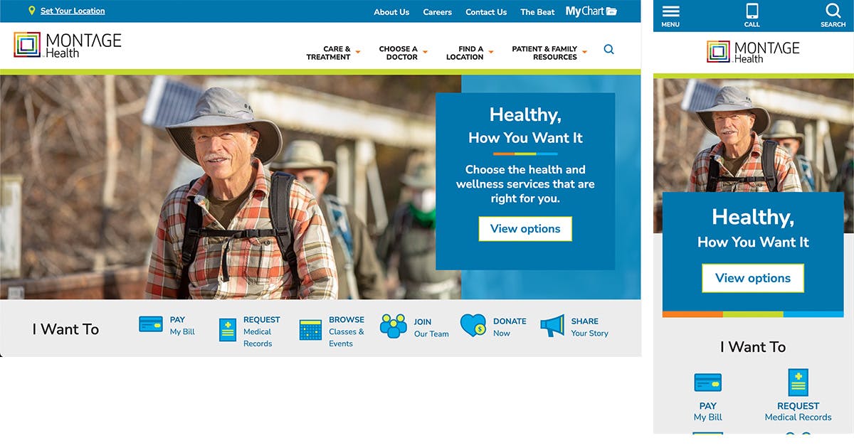
Improvements they can make.
- Adding a contact form on the homepage makes it easy for patients to make inquiries. Phone number and email address should be displayed at the top. Adding a Live Chat function will improve user experience.
We hope that from the above list, you have an idea of the kind of healthcare website design you would like. If you want the best medical office website design, contact the Marketing 1776 team. We are a reliable medical website designer that you can trust.