9 best landscaping website designs to grow your business
Whether you are a landscaper looking to build a new website or you want to upgrade the existing one, the design examples below will inspire some fantastic ideas. Local businesses are turning to new digital marketing channels, and creating a website is the most paramount of them all.
More people rely on the internet to find gardening and landscaping solutions for their residential and commercial properties. Therefore, it has become a necessity for landscaping companies to build high-quality website designs.
This is where the Marketing 1776 team comes in to assist you in creating the best landscaping website online. Not only do we build a professional-looking site, but we add all the essential elements needed to boost your ranking on search engines.
In addition to optimizing your backend, we ensure the landscaping website is designed to be visually appealing, user-friendly, and highly responsive. Furthermore, we combine your ideas with our expertise to ensure that your landscaping business has a solid online presence.
The best website design for landscapers
The best website design template for landscape designers goes beyond visuals. While having a modern design and a captivating home page is necessary, the website must rank well in local searches for landscaping-related keywords. For instance, when people search for 'best landscaping near me,' your website should be among the first on google.
- Attracts new customers to your business - Top-rated websites for landscape companies consistently rank high in search engines. The higher you are, the more clicks you get.
- Converts visitors to paying customers - A proper web design can compel customers to book your landscaping services.
- Builds credibility - Studies show that potential customers are more likely to trust your landscaping projects if you have a website.
- Makes you stand out from the competition - Many local businesses in the landscaping industry already exist, and some even have a website. However, you can customize your website to tell a story and explain why your work and services are the best in town!
Must-have elements in top landscaping websites designs
With all the correct elements on your website, you can completely transform your landscaping business and save any further expenses you would have used in marketing. For gardeners, having an excellent landscaping website requires a few things. The goal is to make it easy for customers to get in touch with you.
Looking at the landscaping website ideas below, you will find some common elements. These features are what encourage visitors to see your work.
- Visually appealing homepage - Your lawn care website should capture visitors' attention as soon as the landing page launches. The colors, fonts, and layout should make the user want to read more or scroll further to see more of your work.
- Call-to-action buttons - Websites for landscapers must have emotional CTAs in the right places. These buttons should encourage clients to take action like 'schedule an appointment,' 'call,' 'request a quotation,' 'send an email,' and ' read more,' to name a few examples.
- High-quality images and videos - A common thing amongst the ten best landscaping websites we've found is that they have original HD pictures and videos. It's true; a picture is worth a thousand words. So include images of your team or recent landscaping projects.
- Social media links - In this digital era, syncing your website to your social media is a great idea. Ensure your site has all relevant social media links to make it easier for visitors to share your content online.
- Credibility factors include testimonials, awards, licenses, and an about page.
- Use of visual hierarchy - Landscape company websites must arrange elements in order of importance, with the most essential appearing first on the page.
- Impressive crawlability and core web tests - These metrics help you asses loading speed, layout stability, and responsiveness on various devices.
- Clickable contact channels - Ensure that customers can contact you with one click!
The best garden design websites for inspiration
Creating an excellent landscaping web design may be tricky, but don't fret! We have compiled some of the most fantastic landscaping websites to help you formulate some ideas!
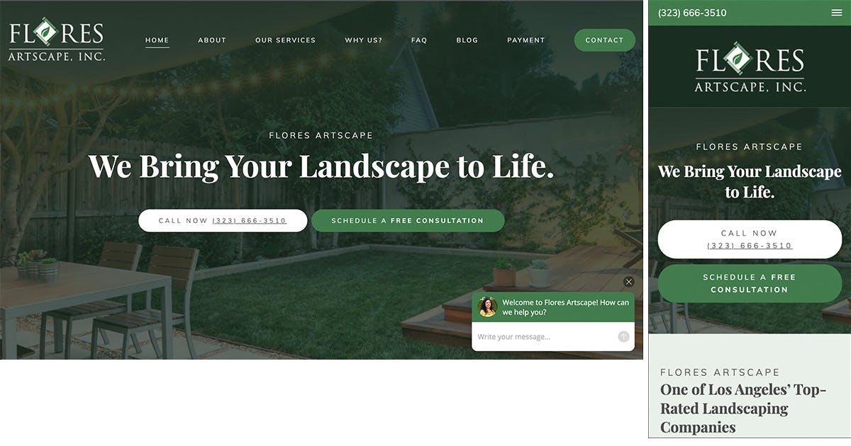
1. Flores Artscape Inc
- https://www.floresartscape.com/
- Los Angeles
Excellent features on the website:
- The typography is beautiful.
- A live chat pops up with an actual image of the support.
- The header has a tagline & clickable contact avenues.
- Elegant green overlay on images.
- Great use of matching images and CTA buttons throughout the site.
- Service areas are included at the bottom.
Recommended changes:
- Add more personalized stories.
- Reduce the white space around the video.
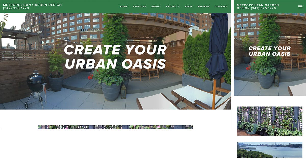
2. Metropolitan Garden Design
- New York
- https://www.metropolitangardendesign.com/
What they have done well:
- The website is excellent and edgy, with straightforward typography.
- Used a minimalist layout.
- Lots of high-quality images for every service area. The phone number is right below the logo.
Recommended improvements:
- The message is straightforward, but it would have been better if the content had been more emotionally engaging.
- Add more trust factors like reviews and awards.
- The phone number at the top is not clickable on the desktop.
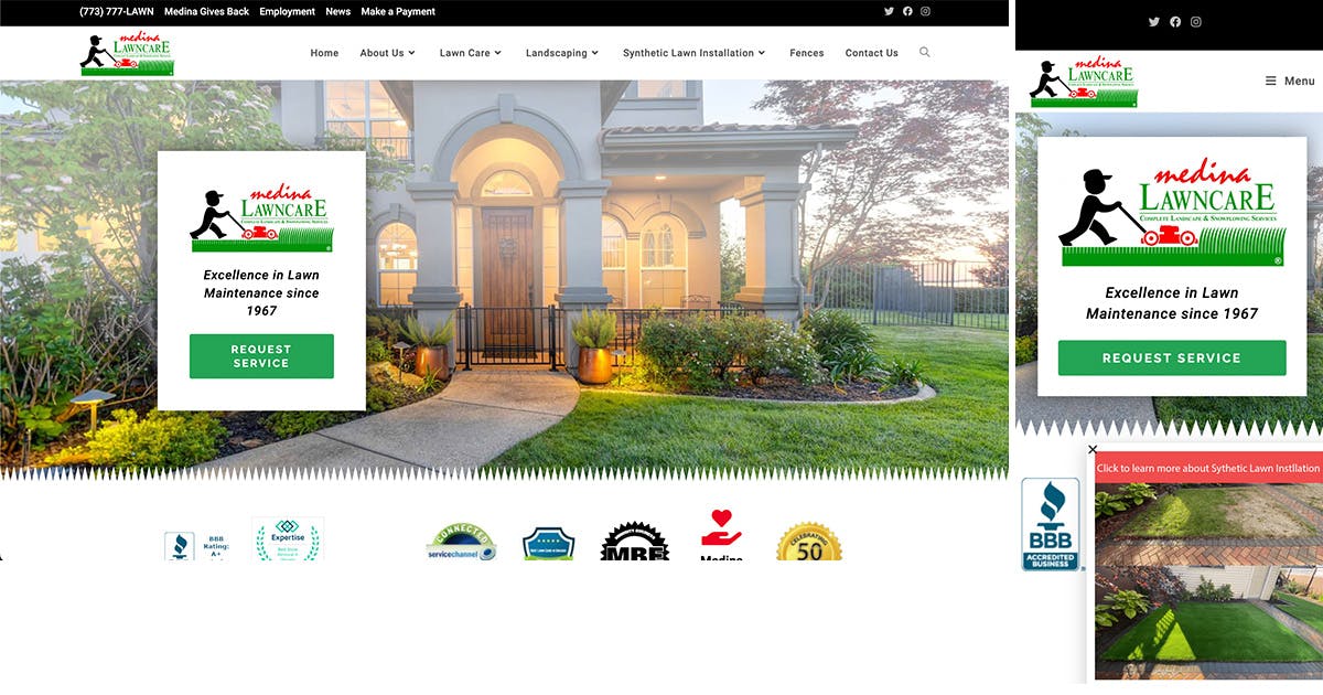
3. Medina Lawn Care
- Chicago
- https://medinalawncare.com/
What they did well:
- Building a search bar at the top.
- Including CTA in the header.
- Listing awards soon on the homepage.
- I am adding a news and blog section.
- Clickable services with original photos.
Changes they can make:
- Place the phone number and email address at the top.
- Make the testimonial widget more user-friendly.
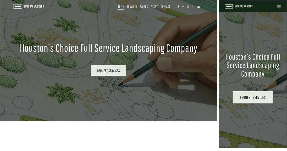
4. Houston Landscaper Org
- Houston
- https://www.houstonlandscaper.org/
Good qualities of the website:
- Email and phone icons are at the top menu.
- CTA button in the header.
- An about section with text and images.
- Short videos that showcase their works.
Suggested improvements:
- Adding more helpful content and resources.
- Making the number and email icons more visible, in contrast to other links in the menu.
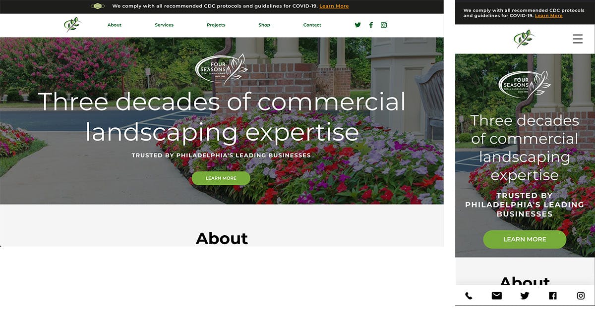
5. Four Seasons Total Landscaping
- Philadelphia
- https://www.fstl1992.com/
What is great about the site:
- Health compliance at the top of the site.
- A beautiful header that seems to match the logo.
- Beautiful fonts against lush green photos.
- Highly responsive shop.
- Messages from the team.
Suggestions for improvement:
- Should improve accessibility on the site.
- Adding extra content or a blog page with guides and news.
- Putting the emails and phone numbers at the top.
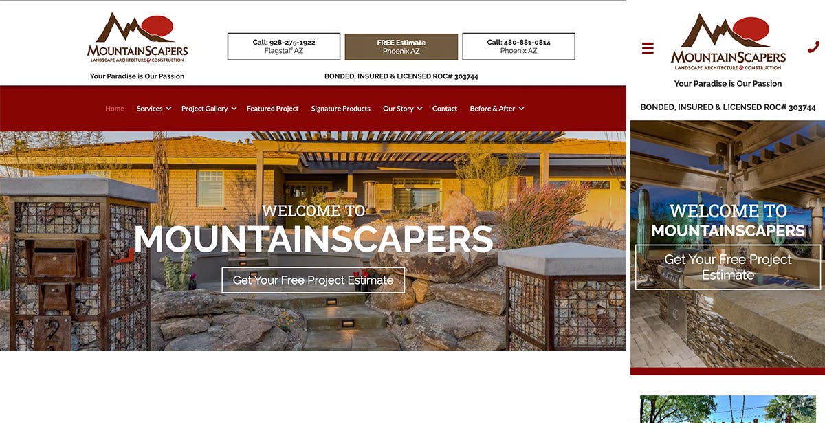
6. Mountain Scapers
- Phoenix
- https://www.mountainscapers.com/
What they have done correctly:
- The vital call-to-action buttons are at the top.
- The proper brown and red color shades are consistent with the brand.
- They placed insurance & license assurance at the top.
- A responsive main menu with sub-categories.
- The slow-motion video for the header.
Recommended corrections:
- Using the same size for the customer review sections.
- Giving the awards more visibility.
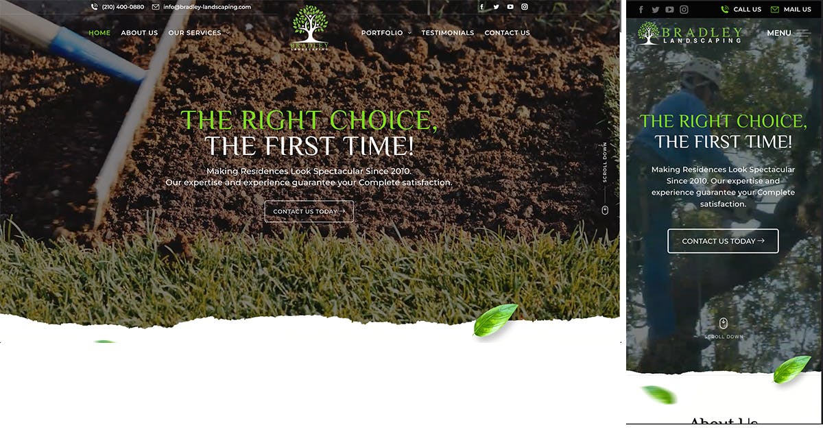
7. Bradley Landscaping
- San Antonio
- https://bradley-landscaping.com/
Excellent elements on the website:
- The website is excellent, with earthy colors and tones.
- A plant identification chart.
- There's a scroll-down arrow.
- Clickable contacts at the main menu.
- Perfect use of white space and gardening images in the service widgets.
Suggested improvements:
- The website is an excellent representation of their work. Still, the captcha in the contact form needs to be more responsive.
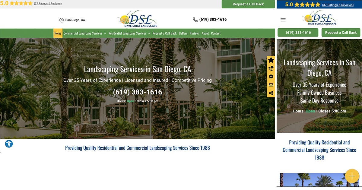
8. Dave Suda Landscape
- San Diego
- https://www.davesudalandscape.com/
What they have down well:
- Placing the pin location and phone number before the main menu.
- Notable main menu with color changes when you hover.
- Brand consistency throughout the site.
- The sticky menu on the right side with contacts and reviews icons.
- Spectacularly framed images.
Recommended changes:
- Gallery images need to be more organized to stand out.
- Use of different typography for headlines and other headings.
9. Avatars Landscaping
- Dallas
- https://www.avatarslandscapingdallas.com/
Great features on the website:
- Modern design.
- Uses a unique color scheme, different from other landscaping websites.
- The call and social media CTA buttons are at the top.
- An edited video is in the header.
![]()
What they can improve:
- Improve responsiveness and accessibility. Some of the blocks are too big and not easy for the eye.
If you like the best landscape design websites on this list, contact us, and we can build a customized one for you! Your customers are one click away, and we can help you get them!